# copy paste this into the console
?theme

# if you are working on scale_color or scale_fill, type ?scale_color or ?scale_fill into the console and pick one of the options in the pop-up menu
?scale_color
?scale_fillWorkshop date: Friday 30 January
1. Summary
Packages
tidyverse
Operations
Review
- read in data using
read_csv()
- visualize data using
ggplot()
- modify theme elements using
theme()
- use built-in themes using
theme_()
- modify colors using
scale_color_()andscale_fill_()functions
- create multi-panel plots using
facet_wrap()
- make line plots using
geom_point()andgeom_line()
- group data using
group_by()
- summarize data using
summarize()
- chain functions together using
|>
- filtering observations using
filter()
- manipulate columns using
mutate()andcase_when()
Data sources
The fish migration data (salmon.csv) is from the Columbia River DART (Data Access in Real Time) on fish migration through the Columbia River Basin in 2023.
The Dungeons and Dragons data (dnd.csv) is from Tidy Tuesday.
The palm tree data (palmtrees.csv) is from the PalmTraits database via Tidy Tuesday.
The Pokémon data (pokemon.csv) is from the {pokemon} package via Tidy Tuesday.
The shark incident data (sharks.csv) is from Riley et al.
The tornado data (tornados.csv) is from the NOAA National Weather Service Storm Prediction Center.
The data from Mt. Vesuvius (vesuvius.csv) is from the Italian Istituto Nazionale di Geofisica e Vulcanologia via Tidy Tuesday.
2. Today’s topic
We’re going to be exploring different ways to customize plots in ggplot2 (remember that ggplot2 is a package within the tidyverse, which you already have installed).
Each group will be responsible for creating a figure manipulating your assigned plot component. You will spend some time exploring each part and creating a figure together. After you are done, you’ll compile slides to teach the class
a) what your assigned plot component is (what it does) and
b) how to manipulate it (in code).
Your challenge is to make the ugliest plot you can! Change the colors, line types, line widths, etc. - whatever your heart desires to make a fundamentally ugly plot.
Before you start customizing
1. Look up the theme() function.
In the Console, type a question mark, then your function name. For example:
Read about your function. Make a list of the arguments that are relevant to you given your plot element.
2. Read about the ggplot2 manual section about your plot element.
If your element is strip, plot, panel, legend, or axis, read the section in “Modifing theme components” that is relevant to you.
If your element is scale_color or scale_fill, read the “Manual scales” section and this guide to using palettes.
If your topic is built-in themes combined with custom theme elements, read the “Complete themes” section.
3. See your elements in action.
If your element is strip, plot, panel, legend, axis, or if you are combining built-in themes with theme elements, see this tutorial from ggplot2tor.
If your element is scale_color or scale_fill, see this tutorial from the R Graph Gallery about dealing with colors.
3. Code
1. Set up
Packages and data
You will need the tidyverse. Insert a code chunk to read that in. Name it packages.
library(tidyverse)You will also need to read in your data. Insert a code chunk to read that in. Name it data.
Only read in the data you are working with!
You do not need to read in all the datasets. Choose the code for the one you are working with.
# shark data (group 1)
sharks <- read_csv("sharks.csv")

# dungeons and dragons data (group 2)
dnd <- read_csv("dnd.csv")

# palm tree data (group 3)
palmtrees <- read_csv("palmtrees.csv")

# mt. vesuvius data (group 4)
vesuvius <- read_csv("vesuvius.csv")

# pokemon data (group 5)
pokemon <- read_csv("pokemon.csv")

# tornado data (group 6)
tornados <- read_csv("tornados.csv")

# salmon data (group 7)
salmon <- read_csv("salmon.csv")
2. Cleaning
For some datasets, you will need to do some cleaning and summarizing.
If you are working with the salmon, tornados, or sharks data frames, you will need to include the following cleaning/summarizing lines in your .qmd file. Insert a new code chunk called cleaning and wrangling in your file. Copy paste the appropriate cleaning code below into your code chunk and run it.
If you are working with the dnd, pokemon, or vesuvius datasets, you will not need any additional cleaning and wrangling. You can skip to the next section.
Mt. Vesuvius (group 4)
# create a new object called vesuvius_clean from vesuvius
vesuvius_clean <- vesuvius |>
  # make sure each year is read as a character instead of a number
  mutate(year = as.character(year))
Tornados (group 6)
# create a new object called tornados_states from tornados
tornados_states <- tornados |>
  # group by year
  group_by(yr, st) |>
  # calculate total property loss in dollars, sum number of tornados, calculate total property loss in billions of dollars
  summarize(total_property_loss = sum(loss, na.rm = TRUE),
            number_tornados = length(yr),
            total_property_loss_bil = total_property_loss/1000000000) |>
  # ungroup the data frame (useful if you're going to do any further summarizing steps)
  ungroup() |>
  # filter state to only include OK, TX, LA, KS
  filter(st %in% c("OK", "TX", "LA", "KS"))
Salmon (group 7)
# create new clean object from salmon
salmon_clean <- salmon |>
  # making sure the date is read as a date
  mutate(Date = mdy(Date)) |>
  # selecting date and 3 salmonid species
  select(Date, Chin, Stlhd, Coho) |>
  # making the data frame longer
  pivot_longer(cols = Chin:Coho,
               names_to = "species",
               values_to = "daily_count") |>
  # mutating species column to display species names in full
  mutate(species = case_when(
    species == "Chin" ~ "Chinook",
    species == "Stlhd" ~ "Steelhead",
    TRUE ~ species
  )) |>
  # filter to only include dates after December 31st 2023
  filter(Date > as_date("2023-12-31")) |>
  # take out any missing values
  drop_na(daily_count)
3. Plot customization
Find the plot that accompanies your dataset.
Create a new code chunk in your .qmd file called plot customization.
Copy paste the code for your plot into your .qmd file to start working with it.
a. Sharks
This plot depicts the total number of shark incidents in New South Wales and Queensland from 1791-2022
              # base layer: ggplot
shark_plot <- ggplot(data = sharks_clean,
                     # aesthetics: x-axis, y-axis
                     aes(x = n,
                         y = shark_common_name)) +
  # first layer: columns to represent counts
  geom_col() +
  # faceting by state
  facet_wrap(~ state) +
  # labels
  labs(x = "Year",
       y = "Total number of shark incidents")

# display the plot
shark_plot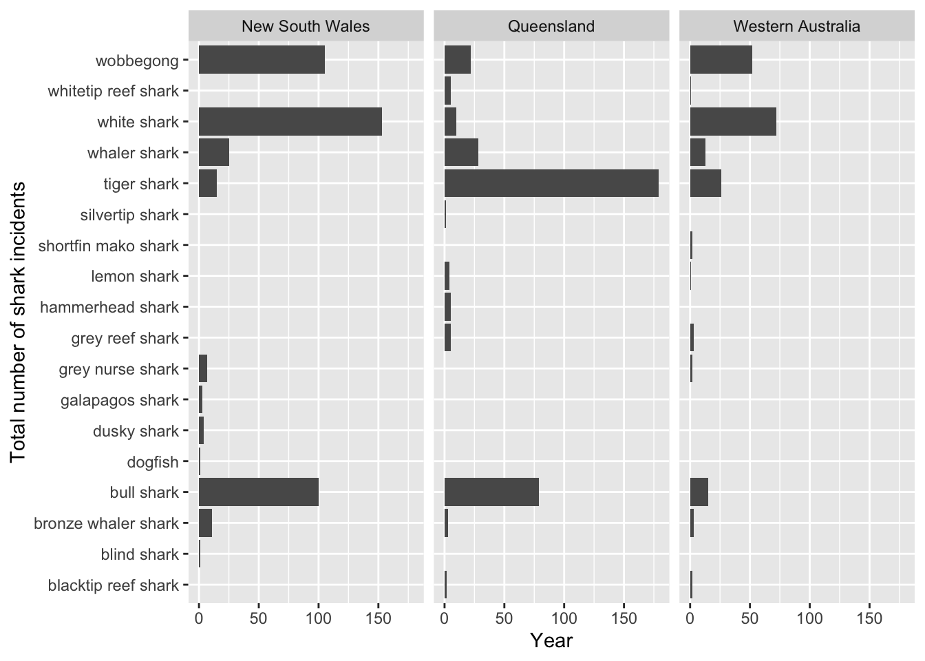
b. Dungeons and Dragons
                   # base layer: ggplot
monster_ratings <- ggplot(data = dnd,
                          # aesthetics: monsters on the y-axis, challenge rating
                          # on the x-axis
                          # y-axis (type) ordered by median challenge rating (cr)
                          aes(y = fct_reorder(type, cr, .fun = median),
                              x = cr)) +
  # first player: boxplot
  geom_boxplot(outliers = FALSE) +
  # second layer: jitter to represent individual mosters
  geom_jitter(width = 0,
              height = 0.1) +
  # relabelling x- and y-axes
  labs(x = "Challenge rating",
       y = "Monster type")

# display the plot
monster_ratings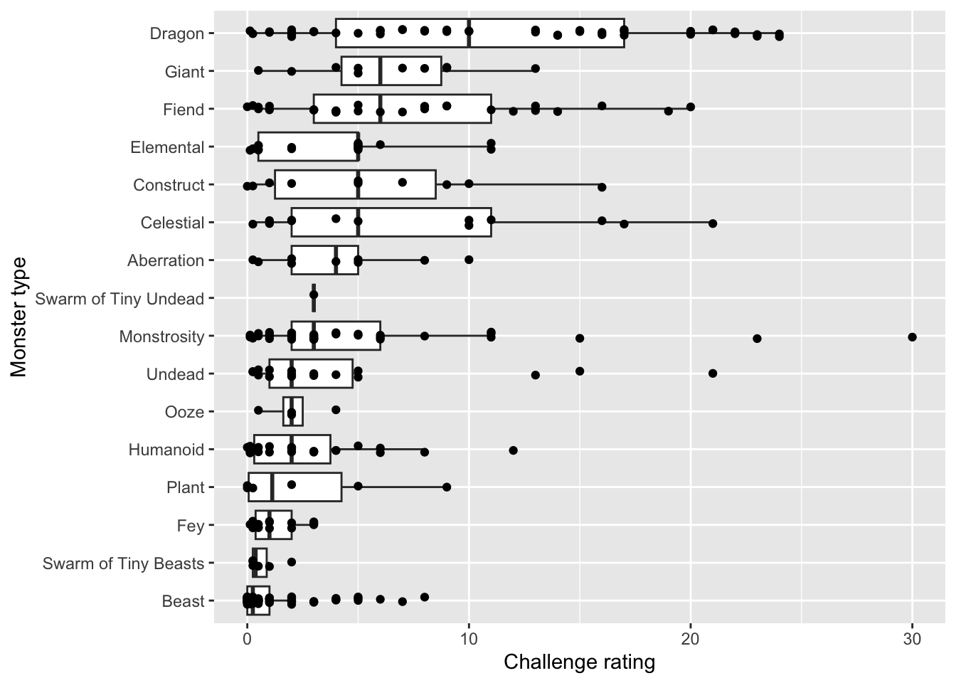
c. Palm trees
                # base layer: ggplot
palm_heights <- ggplot(palmtrees,
                       # aesthetics: palm subfamily on x-axis, stem height on
                       # y-axis, color by subfamily
                       aes(x = palm_subfamily,
                           y = max_stem_height_m,
                           color = palm_subfamily)) +
  # first layer: points to represent each species of palm
  geom_point() +
  # second layer: quick way of showing means in the middle of each set of points
  stat_summary(fun = mean,
               geom = "point",
               color = "red",
               size = 2)

# displaying the plot
palm_heights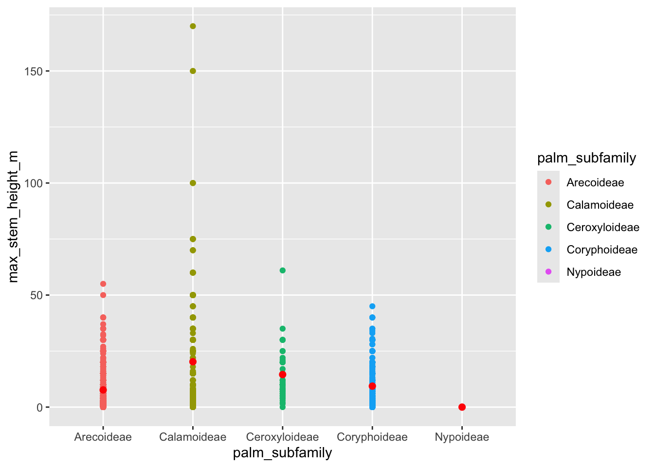
d. Salmon
This plot depicts daily counts of salmon through Bonneville Dam in Columbia River Basin, Oregon in 2024.
               # base layer: ggplot
salmon_plot <- ggplot(data = salmon_clean,
                      # aesthetics: x-axis, y-axis, and color
                      aes(x = Date,
                          y = daily_count,
                          color = species)) +
  # first layer: points
  geom_point() +
  # second layer: line
  geom_line() +
  # labels
  labs(x = "Date",
       y = "Daily fish count")

# display the plot
salmon_plot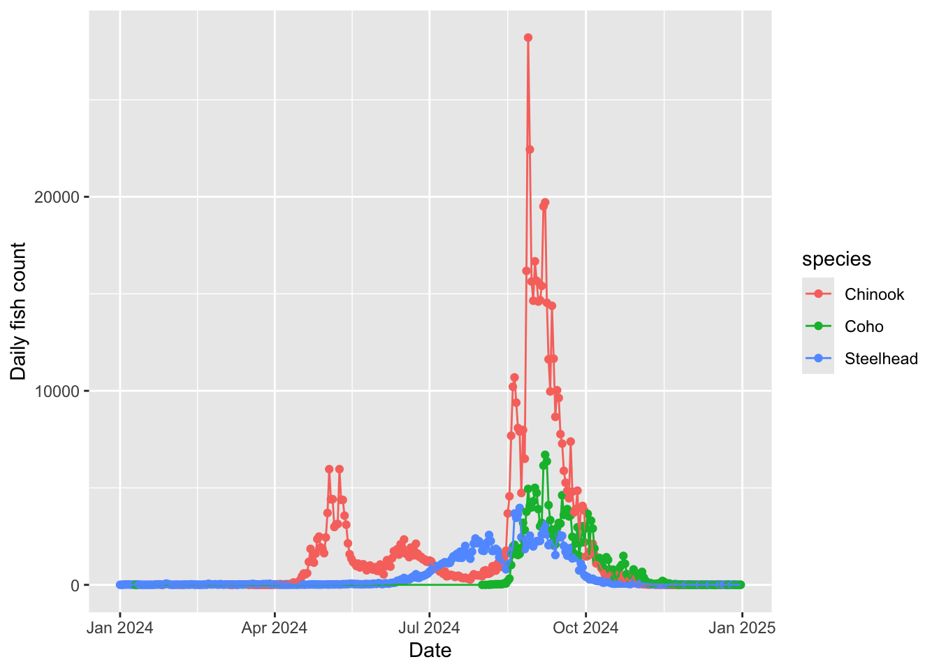
e. Pokémon
              # base layer
pokemon_hp <- ggplot(data = pokemon,
                     # aesthetics: hit points (hp) on x-axis,
                     # pokemon type ordered by median hit points on y-axis
                     # color points by type and reorder legend by median
                     aes(y = fct_reorder(type_1, hp, .fun = median),
                         x = hp,
                         color = fct_reorder(type_1, -hp, .fun = median))) +
  # first layer: display points representing each individual pokemon
  geom_point() +
  # second layer: quick way of displaying medians
  stat_summary(fun = median,
               geom = "point",
               size = 2,
               color = "red") +
  # relabelling x- and y-axes
  labs(x = "Hit points",
       y = "Pokémon type")

# displaying plot
pokemon_hp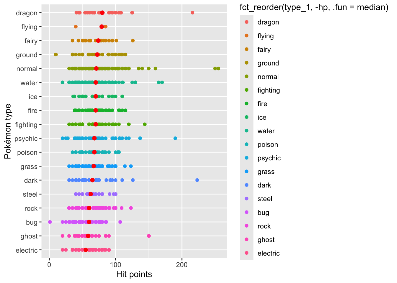
f. Tornados
This figure depicts total property loss (in dollars) due to tornados in US from 1950-2022
tornados_by_state_plot <- ggplot(data = tornados_states,
                                 aes(x = number_tornados,
                                     y = total_property_loss_bil,
                                     color = st)) +
  geom_point()


tornados_by_state_plot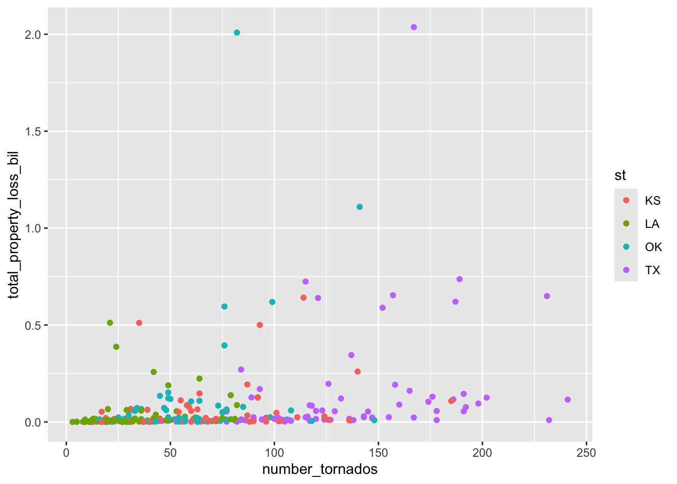
g. Mt. Vesuvius
                 # base layer
vesuvius_plot <- ggplot(data = vesuvius_clean,
                        # aesthetics: x-axis is time, y-axis is duration magnitude,
                        # color points by year
                        aes(x = time,
                            y = duration_magnitude_md,
                            color = year)) +
  # first layer: points representing duration magnitude of a seismic event
  geom_point() +
  # second layer: lines to connect points
  geom_line() +
  # relabelling x- and y-axes
  labs(x = "Date and time of seismic event",
       y = "Duration magnitude (Md)")

# displaying plot
vesuvius_plot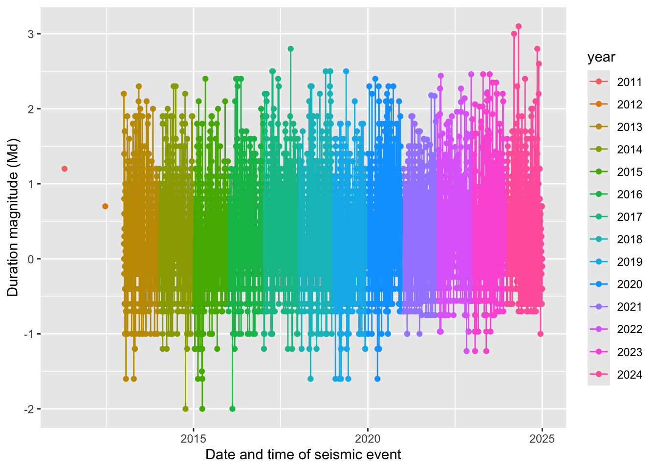
4. Plot components to focus on
a. Group 1: strip in theme()
Demonstrate how to:
- change the background
- change the border
- change the placement
- change the text size and font
b. Group 2: plot in theme()
Demonstrate how to:
- change the plot margin
- change the plot background
- change the plot title, subtitle, and caption text position and color
c. Group 3: panel in theme()
Demonstrate how to:
- change the panel border
- change the panel major grid lines (vertically and horizontally, in separate arguments)
- change the panel minor grid lines (vertically and horizontally, in separate arguments)
- change the panel background
d. Group 4: legend in theme()
Demonstrate how to:
- change the legend frame
- change the legend key size
- change the legend text size
- change the legend position
- change the legend row numbers
e. Group 5: axis in theme()
Demonstrate how to:
- change the axis text color and font
- change the axis tick length (major and minor ticks)
- change the axis line colors and line types
f. Group 6: scale_color or scale_fill functions
Demonstrate how to:
- use a color palette package
- apply it to a color scale
g. Group 7: built in themes (theme_) with your own customization using theme()
Demonstrate how to:
- use a built in theme and
- change additional components using the
theme()elements of your choice (one of each element from a - e)