    Paired t-test

data:  production$`2022` and production$`2023`
t = -1.5211, df = 27, p-value = 0.1399
alternative hypothesis: true mean difference is not equal to 0
95 percent confidence interval:
 -51595337   7664551
sample estimates:
mean difference
-21965393 Due on Thursday the 12th (Week 6) at 11:59 PM
Description
In this midterm, you will demonstrate your ability to synthesize lecture concepts and technical skills from workshop. At this point, you have the conceptual ideas you need (for example, what is the appropriate test to use if you want to compare groups?) and the technical skills you need (for example, summarizing data, visualizing data). You also have the investigative skills you need (for example, reading for tasks, googling!). You will use all these components to complete the midterm.
This midterm is open note, open internet, open everything; feel free to also talk with classmates and friends.
Set up tasks
As usual, create a new folder in your ENVS-193DS folder for midterm materials (a logical folder name would be midterm). Create an Rproject. Download all materials from Canvas into your midterm folder.
Start a new Quarto or RMarkdown document for your midterm. Make sure you read in your packages and data only at the top of the document.
Read in and store the data for Problem 3 as an object called tussocks.
Read in and store the data for Problem 4 as an object called temp.
Problems
Problem 1. Understanding and critiquing written communication
Skills you will demonstrate
In this problem, you will be responsible for demonstrating your understanding of the different components of a statistical test. All numbers describe a different statistical concept; how well do you understand what those numbers represent?
Description
The purple sea urchin (Strongylocentrotus purpuratus) fishery is a major player in California’s seafood exports. Purple sea urchins are valued for their gonads, which are eaten as uni.
Climate change is expected to influence urchin gonad weight (measured in grams). You’re a resource manager who wants to know how urchin gonad weight could differs between heated conditions (that represent future climate scenarios) and ambient temperatures (which urchins experience now). You find a study in which researchers examined this effect. In their results section, they wrote:
There was a difference in urchin gonad weight between heated and ambient treatments (Student’s two-sample t-test, t(53) = -13.5, p < 0.001).
Components
a. Hypotheses
The researchers didn’t state their hypotheses explicitly anywhere in the paper. In one sentence each, write the null (\(H_0\)) and alternative (\(H_A\)) hypotheses in statistical terms only.
b. Test type
The researchers ran a specific type of t-test. What must have been true for them to use this type, as opposed to any other? Respond in 1-2 sentences only.
c. Test summary components
In parentheses, the researchers cite some information about their test:
(Student’s two-sample t-test, t(53) = -13.51, p < 0.001)
In 1-2 sentences each, explain the meaning of:
- t
- 53
- -13.51
- p < 0.001
Be specific in your explanation. What is the term or name that describes the component, and what does that component represent in the specific context of this type of test, hypotheses, or variables?
d. Missing information
The researchers reported their findings, but you know that there’s more they could have reported. Identify 2 other components or statistics they could have included (note that there may be more than 2 additional components that could make sense).
For each of your pieces of missing information, explain why it would be relevant to either addressing the hypotheses or building a biological narrative. Be specific in your explanation, using variables, groups, etc.
Real-world research
The ideas behind this problem are drawn from a paper in which researchers examined the effects of temperature and diet on metrics describing urchin gonads (e.g. weight, quality, absorption). The citation is below:
Azad, A. K. et al. 2011. “Effects of diet and temperature on ingestion, absorption, assimilation, gonad yield, and gonad quality of the purple sea urchin (Strongylocentrotus purpuratus)”. Aquaculture 317:1-4. https://doi.org/10.1016/j.aquaculture.2011.03.019.
Problem 2. Interpretation and communication
Skills you will demonstrate
In this problem, you will be responsible for interpreting the results of a test with which you may be familiar, but haven’t seen. You will also demonstrate your ability to interpret code output and synthesize the statistics in writing to ground the stats in biology for a scientific audience.
Description
In California, climate change is expected to make drought and precipitation regimes more unpredictable. When long droughts are interrupted by extreme precipitation, this phenomenon is called hydroclimate volatility or precipitation whiplash.
Precipitation whiplash may be a problem for agricultural production in the state, as crops depend on water availability to be productive. However, producers have also found ways to adapt to long dry spells such that major fluctuations in climate and precipitation may not impact production very much.
In this problem, you will be presented with a test that you have not seen before, but that you have the skills to interpret. The dataset comes from Kern County, CA which is a region of major agricultural production. The researchers used data on crop production from 2022 (an especially dry year) and 2023 (an especially wet year) to explore the potential effects of precipitation whiplash on production.
Before completing this problem, read about the study here.
Real world research
This work was led by Dr. Ashley Larsen, research professor in Bren. The full citation for this work is:
Larsen, A. E. et al. 2025. “Weathering the storm: precipitation whiplash has limited effects on agricultural production and pesticide use in California.” Environmental Research Letters 20. https://doi.org/10.1088/1748-9326/adf131.
In the study, the researchers write:
The general distribution of crops remained similar for most major crops, with pistachio, processing tomatoes, barley, corn for forage/fodder, wheat for forage/fodder and potato increasing by more than 1000 ha and almond, grape and cotton decreasing by more than 1000 ha. The analysis of county crop statistics echoed these results, with a non-significant change in total value, yields, and harvested hectares and a significant increase in total production in 2023, based on a paired t-test of 28 crops (table S3).
Components
a. Hypotheses
In one sentence each, write the null (\(H_0\)) and alternative (\(H_A\)) hypotheses in statistical terms only to answer the following question:
Does mean crop value (measured in 1000s of US dollars) across 28 crops in Kern County, CA differ between 2022 and 2023?
b. Statistical summary
The researchers include the components of their t-test, but a) summarize their analyses in the supplement rather than the main text and b) include all these components in a table rather than in writing. Both these choices are common when reporting statistics, but you need to understand what they mean.
Find the supplementary table in which the researchers summarize the results of their tests.
Compare this table with the results of a paired t-test run on their dataset below:
Identify two pieces of information that are the same between the table in the paper and the test output above. Include their values.
Additionally, in 2-5 sentences total, identify 2 pieces of information the test output provides that the researchers do not and describe what these values mean in the context of this question, hypotheses, or interpretation. Use specific terms to show you understand the variables, what is presented in the table, and what is presented in the results of this test.
c. Writing a new statement
In 1-2 sentences only, write a new statement with the interpretation and results of this test from the output in part b. Be sure to include all components of the test summary in the parentheses that would be important for understanding the structure of the test.
Where necessary, round values to 2 decimal points and/or express as < 0.001.
d. Statistical implications
Imagine that you are an agricultural consultant working for a blueberry farmer in Kern County who is worried about how climate change is going to influence the value of their berries.
What and how would you communicate to this farmer about the implications of the results in parts b and c? How might they be able to prepare for potential uncertainty in drought and precipitation regimes in the state? Express your thoughts in 3-5 sentences, using the context for this study as Larsen et al. write in their introduction and discussion.
Problem 3. Reproducing an analysis
Skills you will demonstrate
In environmental studies, open research means that researchers make their data and/or their code available for anyone to see. This means that anyone should be able to reproduce the analysis, even if they are not on the research team. In this problem, you will demonstrate your ability to read a paper to understand the context for a research study and its statistical analysis. You will then demonstrate your ability to take a data set and analyze it, using the researchers’ original analysis as a guide.
Description
You will reproduce the analysis in: Steketee, J. K. et al. 2022. “Small Herbivores with Big Impacts: Tundra Voles (Microtus Oeconomus) Alter Post-Fire Ecosystem Dynamics.” Ecology 103:7. https://doi.org/10.1002/ecy.3689.
Specifically, you will recreate the analysis that allowed the researchers to make this statement (in bold):
Although tussock density was lower at the burned site, tussocks were larger and Eriophorum more abundant (Table 1, Figure 2a; Klupar et al., 2021). Average tussock mound diameters were larger by 4 cm (Table 1; p < 0.001).
Read all parts of the paper before starting this problem.
Getting the data
This statement relies on the dataset stored here:
Rocha, A. 2021. Tussock height and diameter in moist acidic tussock tundra at the site of the 2007 Anaktuvuk River fire scar, and nearby unburned tundra measured in 2016 ver 1. Environmental Data Initiative. https://doi.org/10.6073/pasta/1dccd3fdb3aa693f9c2b69a24f8306ed.
Download the data into your midterm directory. To understand the data structure, read the metadata (under Resources > View full metadata > Data Entities).
Components
a. Variables
In 1-2 sentences each, describe:
- the response variable (with units and what type of variable it is)
- the predictor variable (include each group)
- how the researchers measured the response variable
For “how the researchers measured the response variable”, cite the specific section of the paper in which you found their description of their process (e.g. the methods section in paragraph 2).
b. Hypotheses
In one sentence each, write the null (\(H_0\)) and alternative (\(H_A\)) hypotheses in statistical terms only.
c. Cleaning and organizing data
Create an object called tussocks_clean. In no particular order, clean the data (you should have stored this as tussocks) by:
- cleaning all the column names
- replacing the values in the
sitecolumn as follows:- replace
SevwithBurned
- replace
UnbwithUnburned
- replace
- selecting only the
siteandaverage_diametercolumn
Use the pipe operator to string functions together. Remember to annotate every new function with a description of what you specifically are doing in that line of code.
Once you are done, display 10 rows from tussocks_clean using the slice_sample() function.
d. Summarizing and table displays
Create an object called tussocks_summary using the tussocks_clean data frame to calculate the means and standard errors for the response variable within the two groups.
Round all numbers to 1 decimal point.
Display only the site, mean, and standard error values in a table using one of the following packages to do so:
gt
flextable
Make sure the column names of the table are polished (no underscores and capitalized in sentence case).
Show all code for your calculations and making/polishing the table. The only output displayed from this section should be your final table.
Double check your table!
Render your document to make sure your table looks right. Do not assume that just because your code works, your table will render correctly.
e. Check your assumptions
Check your assumptions using one visual tool and one statistical tool only.
You must check both core assumptions for this type of test. You must be able to check both assumptions using one tool (either visual or statistical) each.
In 1-2 sentences each, summarize your thoughts about your assumption checks. Be specific by describing the variable and visual components of the plot you made and results of the test.
f. Do a test
Conduct the appropriate test that matches with your hypotheses.
Calculate the appropriate effect size using a function from the rstatix package.
Make sure your annotated code and outputs for both the test and the effect size are visible.
g. Written communication
Again, the authors expressed their results as follows:
Average tussock mound diameters were larger by 4 cm.
In 1-2 sentences only, update this interpretation with results of the test, effect size, sample means, standard error, and sample sizes. Include a comparison of means, as the authors do.
Be sure to include all components of the test summary (for example, degrees of freedom, distribution, test statistic, confidence interval, etc.) that are important for understanding its structure.
h. Making a new figure
The authors do not visually represent this variable in their paper. Make a new figure that displays the mean and standard error (as the authors do in figure 3b for a different variable) showing the underlying data. For full credit:
- take out the gridlines and make the plot and panel background white
- jitter observations horizontally but not vertically
- use colors for each site that are different from
ggplot()defaults
- use shapes for each site that are different from
ggplot()defaults
- use transparent open shapes to represent the underlying data
- take out the legend
- include a plot title
- relabel the x- and y-axes
- include the units on the y-axis label
- put your name as the subtitle
i. Write a caption
In text (not in your code for your figure), write a caption for the figure you made in part h. Include a data citation.
Problem 4. Cleaning, wranging, and visualization
Skills you will demonstrate
Figures are built on data; however, to make a figure, you need to understand the data structure and any cleaning, wrangling, or summarizing steps to create it. In this problem, you will demonstrate your ability to clean, wrangle, and/or summarize a data set to create a figure, using a final figure as a guide.
Description
In this problem, you will use a data set of ocean temperature from the Santa Barbara Coastal LTER from three different sites: Isla Vista reef, Naples Reef, and Santa Cruz Island (Diablo).
You will need to recreate the following figure:
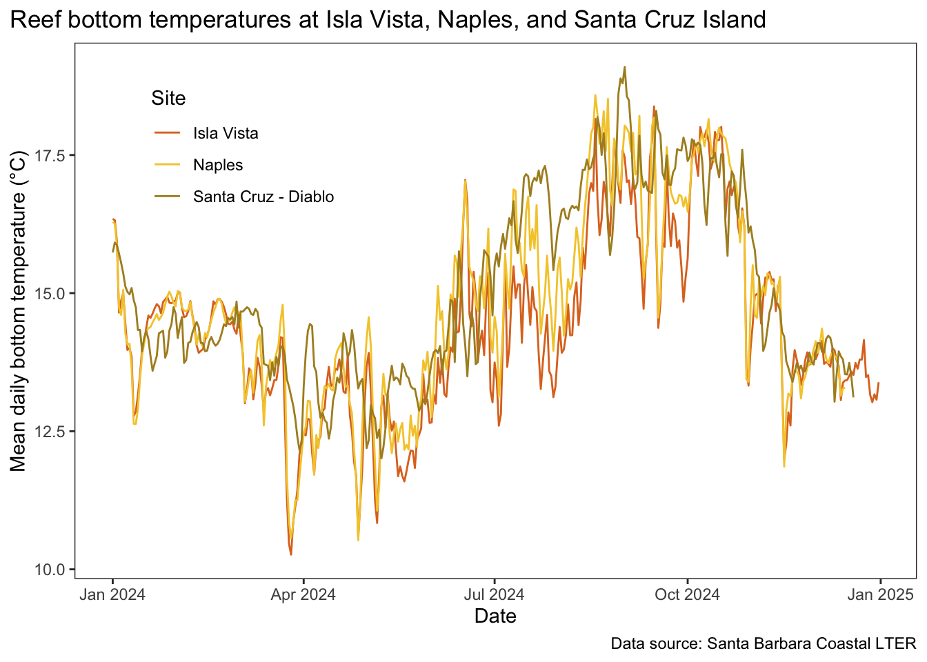
The caption for the figure is as follows:
Figure 2. Mean daily bottom temperatures at Isla Vista, Naples, and Santa Cruz Island. Lines represent mean daily temperatures calculated from hourly recorded temperature with loggers affixed to the ocean floor at Isla Vista (red), Naples (yellow), and Santa Cruz (Diablo) (green). Data from 2024 are shown. Data source: Santa Barbara Coastal LTER. Accessed February 2026.
Components
a. Initial cleaning, wrangling, and summarizing
The following chunk of code creates and object called temp_clean. Copy and paste this code into your document.
This code is missing pipe operators at the end of every line section. Be sure to add them in as you go.
Where prompted in the code annotations, fill in your responses to describe what each function is doing, and how the data frame changes. Only write your responses in the annotations. See 8 and 9 for an example.
temp_clean <- temp

  # 1. what package is this function from?
  # insert response here
  # 2. What changes after this function and how?
  # insert response here
  clean_names()

  # 3. what package is year() from?
  # insert response here
  # 4. what is this combination of mutate() and year() doing?
  # insert response here
  mutate(year = year(date_local))

  # 5. what package is filter() from?
  # insert response here
  # 6. what is being filtered in this functional call?
  # insert response here
  # 7. what sites and year(s) do you expect to be included
  # in the resulting data frame?
  # insert response here
  filter(site %in% c("NAPL", "SCDI", "IVEE") &
           year == "2024")

  # 8. what column is manipulated?
  # the site column
  # 9. what changes about the values in this column?
  # the site acronyms are changed to full names
  mutate(site = case_when(
    site == "IVEE" ~ "Isla Vista",
    site == "NAPL" ~ "Naples",
    site == "SCDI" ~ "Santa Cruz - Diablo"
  ))

  # 10. what is being calculated? and at what scale
  # (e.g. annual, monthly, daily)?
  # insert response here
  # 11. give an example
  # insert response here
  group_by(site, date_local) |>
  summarize(mean_daily = mean(temp_c)) |>
  ungroup()
Once you are done, display 5 rows from the data frame using slice_sample().
b. Make the figure
Recreate the figure. Specifically, recreate the:
- x-axis and label
- y-axis and label (with ° symbol)
- title and title position
- data source text and location
- legend position (doesn’t have to be exact, but does have to be in the top left)
- panel background (blank)
- axis lines and ticks
- geometry (hint: there is only one), and
- different colors (you don’t have to use these exact ones - just use different colors for each site that are different from
ggplotdefaults)
c. Interpretation
In 1-3 sentences total, summarize:
- when the highest temperatures are recorded
- when the lowest temperatures are recorded
- and what visual components of the plot demonstrate these points.
My figure doesn’t look right when I render my document.
You will have to set the code chunk options to make a larger figure. Click the gear button in the code chunk to set those options.
Checklist
Your submission should:
Additionally, your submission should only include the components listed below:
for Problem 1:
for Problem 2:
for Problem 3:
for Problem 4:
Additionally, you should have:
Lastly, check out the rubric on Canvas to see the point breakdown in more detail.
General formatting components
For annotations, you should have meaningful comments for:
- each line of visualization code and/or ggplot geom/theme call (not needed for each argument, though good to have)
- each function in any piping operations
- set up code to denote where packages and/or data are read in
- each argument of a test call (e.g.
var.test(),t.test())
For readability, you should make sure that:
- all messages/warnings are hidden
- all code is contained in code chunks (double check line breaks in comments once you render your document)
- all text is where it’s supposed to be (all components like headers, main text, superscripts/subscripts, etc. show up correctly)
- code includes carriage returns, spaces, etc. to make pipe operations and arguments clear
- code includes consistent spacing and indents